Creating Accessible MS Word Documents
Introduction
Good document design makes documents the usable by the largest number of users. Learning a few techniques and making these techniques habits will result in documents that present fewer barriers to your readers. You will also see some benefits for you as the designer. For example, using true headings allows you to make global changes to all of your headings in your entire document. This also allows you to create a table of contents with just a few clicks.
Choosing Fonts and Font Size
Font Families
Choose fonts that are clear and easy to read. Sans serif fonts may be easier to read for some people but a simple serif font, such as Times New Roman is considered fine to use as well. Avoid overly decorative fonts or light fonts.
Font Size
If you are printing a document, use a 12-point or larger font. For shorter documents, increasing the font size to 14-point will make it usable by a larger number of people. Having an electronic version of your documents available will allow a user to increase the size of the text if needed.
Capitalization
Presenting large amounts of text in ALL CAPS or SMALL CAPS can make the text difficult to read. Both should be used sparingly or avoided altogether.
Using Headings to Provide Structure
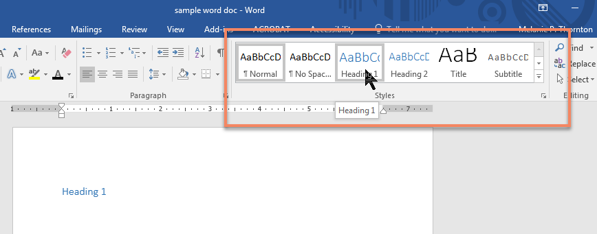
Apply a Heading
To apply a proper heading, highlight the heading text and select the appropriate heading from the styles group on the home tab.
Use Heading Styles Only for Headings
When you need to add emphasis or enlarge text that is not a heading, avoid using the headings styles to modify the look of the text. In that case, change the text using the font group tools.
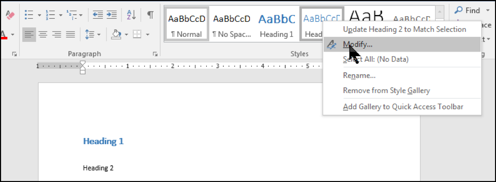
Modify Heading Styles
Besides improving accessibility, using true headings in your documents also offers an advantage to you, the document designer. If you are creating a long document and decide that you want to change the color of a heading, simply changing the heading style once will change all occurrences of that heading.
You can do this in two ways. Right click on the specific heading you want to change in the styles group on the home ribbon and select Modify. When the Modify Style window appears, make whatever changes you want to make in the style and select OK. The new style should be reflected in the style group.
The other option is to change the style in your text and choose Update Heading 2 to Match Selection (or whatever level heading you are changing.)
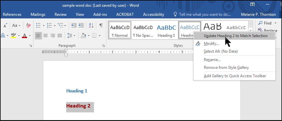
Either method will result in all headings of that level being changed to reflect the new look.
Creating Meaningful Hyperlinks
When creating hyperlinks, make sure the text associated with the link is understandable out of context.
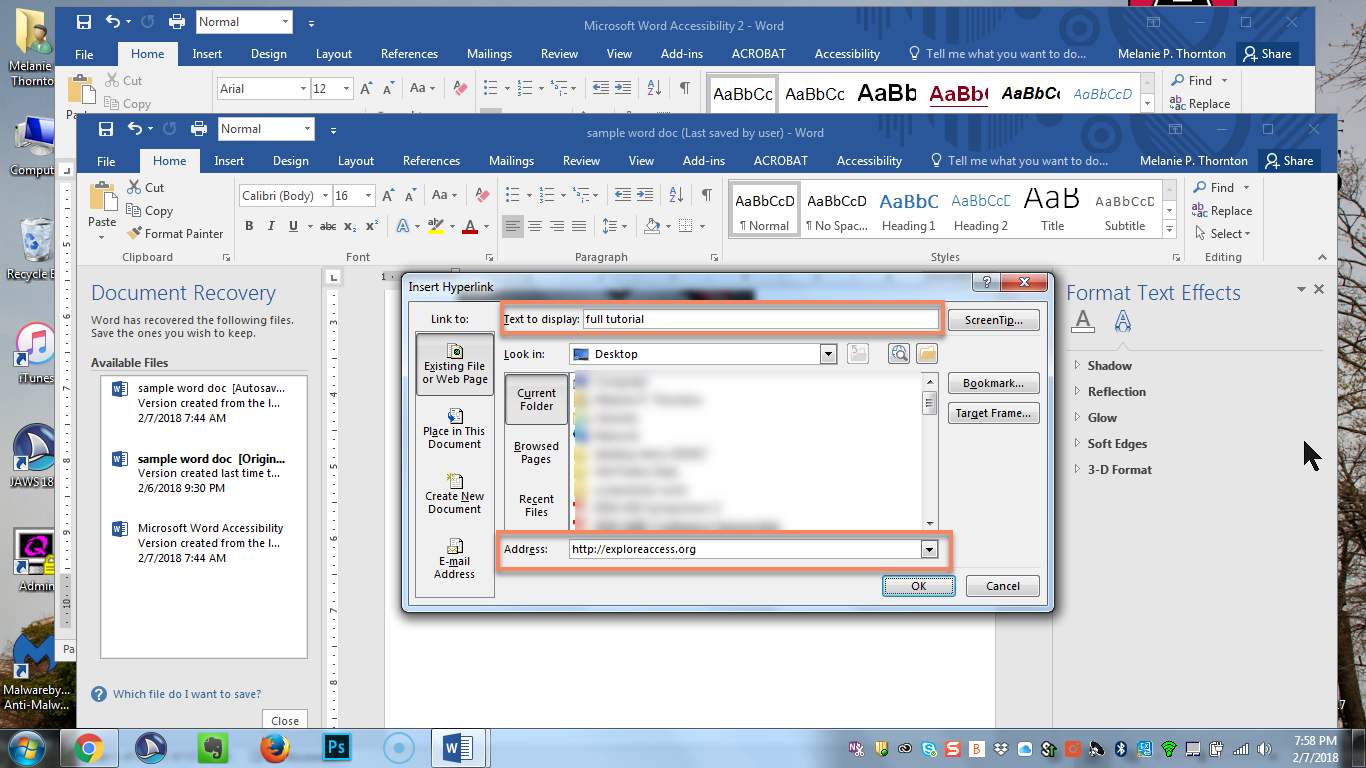
Avoid this: You may find this tutorial here.
Instead, do this: You may find this tutorial on creating accessible documents on our website.
If the document is likely to be printed, you will also need to include the full URL. If the URL is long, consider creating a smaller URL by using a service such as tinyurl.com or bitly.com. A suggested format would be as follows:
You may find this tutorial on creating accessible documents on our website.
(https://exploreaccess.org/creating-accessible-documents/)
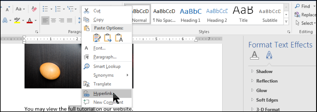
To create a hyperlink from the text, highlight the text you want to use for link. Right click on the highlighted text. Choose Hyperlink from the context menu.
When the dialog box appears, make sure the text that you want to be included in the hyperlink is correct and add the URL below.
Making Images Accessible with Alt Text
Simple Images
A screen reader cannot discern the contents of an image. Alt text provides a way to make the contents of the image accessible to a blind person who is reading your document. To add alt text, right click on the image and choose Format Picture from the context menu.
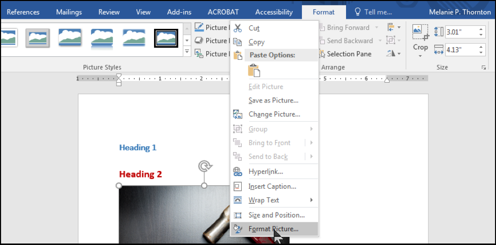
The Format Picture dialog box should appear to the right of your document. Select the Layout and Properties tab and then select Alt Text.
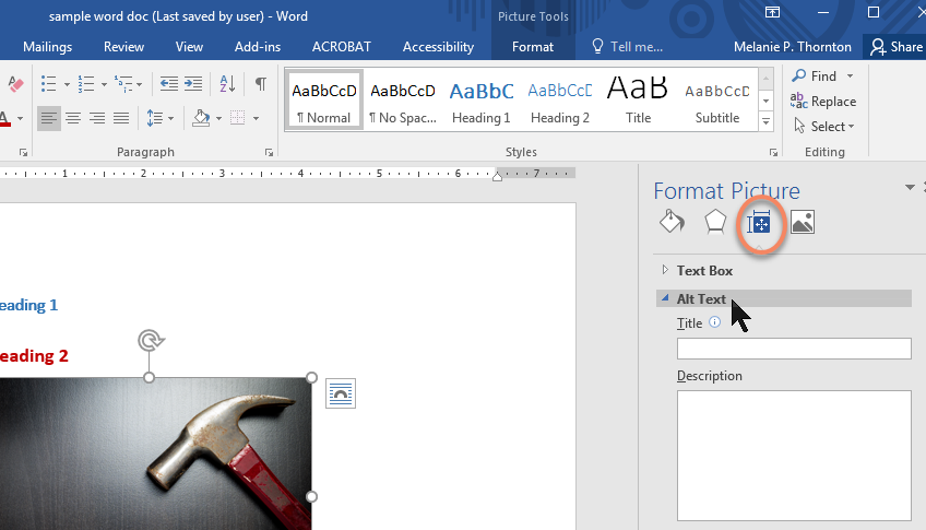
Type a description of the image in the box labeled Description. There is no need to type “image of” or “picture of.” Simply describe what is in the image. The image used in this tutorial, for example, could be described as “A hammer and an egg side by side on a table.”
Complex Images
Some images, such as graphs, charts or informative illustrations require fairly lengthy explanations to make them accessible. When this is the case, there are a few options:
- Provide a brief alt text description of the image and a longer description within the text of the document. This may be helpful for others as well since some people have difficulty understanding charts and graphs.
- Provide a brief alt text description of the image and create a section at the end of the document for long descriptions.
- Provide a brief alt text description of the image and create a separate document with a long description of the image.
Example of Option 1
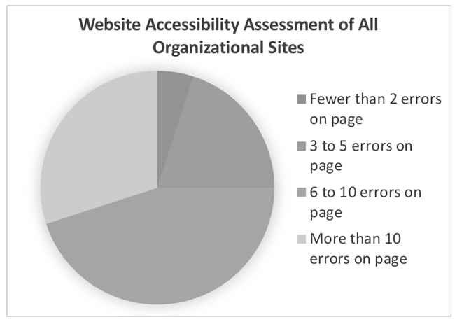
The example below shows how the pie chart with a description might look within your document.
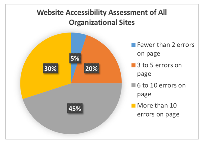
Chart 1. Website Accessibility Assessment of All Organizational Charts.
Findings from the assessment indicate the following: 5% of organizational websites had fewer than 2 errors on the home page; 20% had 3 to 5 errors; 45% had 6 to 10 errors; and 30% had more than 10 errors on the home page.
Note: The example above is set apart visually using a border. This is an alternative to text boxes and will be explained in more detail later in this document.
Since the pie chart is described within the text, adding a brief alt text description will suffice. The alt text description might be: Chart 1. Website Accessibility Assessment – Full description below the pie chart.
When adding alt text to charts and graphs created in MS Word, take care to add the alt text to the full chart or graph. To do this, right click on the outer border of the image, choose format chart area (or format object for other types of art) and add the alt text just as you would for a simple image.
Using Color and Ensuring Good Contrast
Color and accessibility intersect in two ways:
- Color alone should not be used to convey meaning.
- Ensuring good contrast between foreground and background elements is important.
Avoid Using Color Alone to Convey Meaning
Let’s look back at the pie chart from the previous section. If a reader were not able to distinguish the colors in the cart, would the meaning still be clear? To consider this, look at this grayscale rendition of the same chart. Is it possible to determine which area of the chart each item from the key is describing?
Even if the percentages were added to the pie chart, the reader would still not know which piece of the pie was associated with each description. A solution would be to add the descriptions (or a label) to the chart itself.
Let’s consider a different example that involves instructions to students preparing for an exam.
Exam Preparation Example
Neurodiversity
Usability
Universal Design
Accessibility and the Web
Assistive Technology end example
Clearly, this would be confusing for someone who does not have access to the colors, whether the person is using a screen reader or does not distinguish between color differences. Altering the instructions slightly can resolve this barrier.
Neurodiversity
Usability*
Universal Design
Accessibility and the Web*
Assistive Technology end example*
Provide Good Contrast
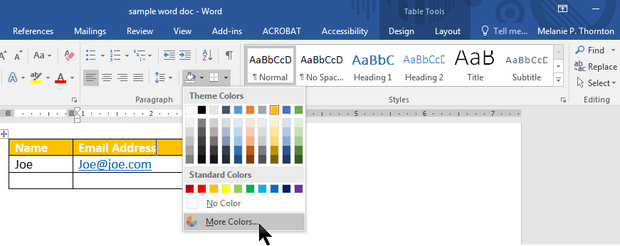
The World Wide Web Consortium’s Web Content Accessibility Guidelines 2.0 (WCAG 2.0) provides guidance on the minimum level of contrast considered to meet accessibility standards. Based on these guidelines, contrast should be 4.5 to 1 or better. Those numbers mean very little without a way to measure contrast. There are several excellent online tools that you can use to analyze color contrast. First, though, you have to determine the RGB color code for the colors you are checking. We’re going to determine if the white text in this table with a yellow fill provides adequate contrast. A similar process can be used for checking text color.
Place the cursor in the data cell with the yellow background, select the dropdown menu to the right of the shading tool, and select More Colors.
When the Colors dialog box appears, you will see the RGB color codes for the shaded area.
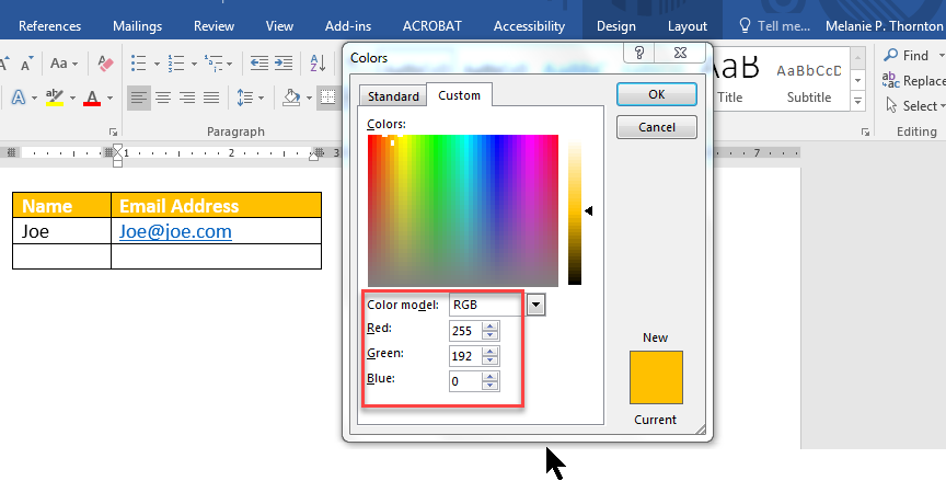
You will want to record those numbers.
Next, you’ll need to find a color contrast analyzer. There are several options online but not all accept RGB codes. One that does can be found at: https://contrastchecker.com
Enter the RGB codes.
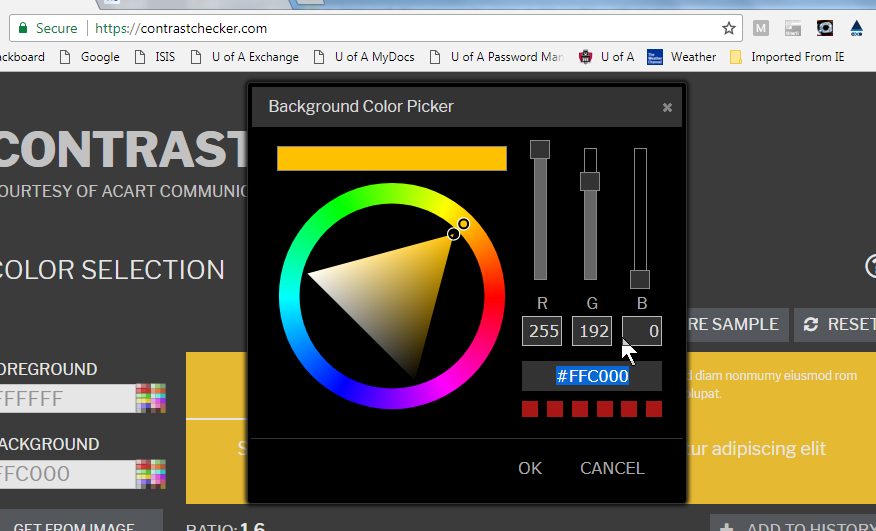
When you select OK, the contrast checker will let you know if the contrast is sufficient to meet the standard you want.
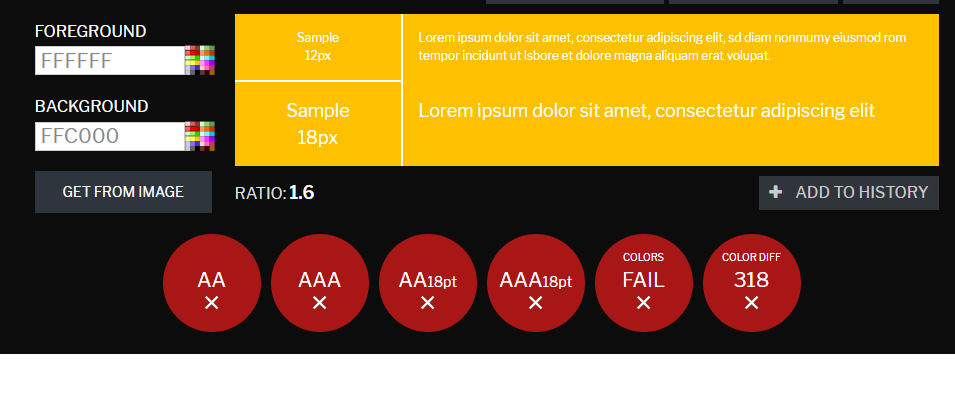
In this case, there is insufficient contrast between the yellow background and the white text.
Creating Data Tables
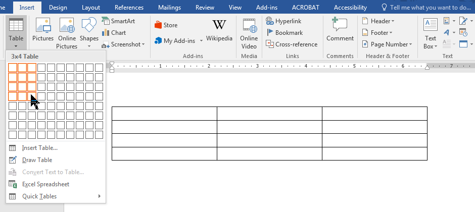
In order to create an accessible table in MS Word, the table has to be a simple table with the same number of cells on each row and column. That is, it is important to avoid merging cells. To create the table, choose Insert > Table, and select the number of columns and rows.
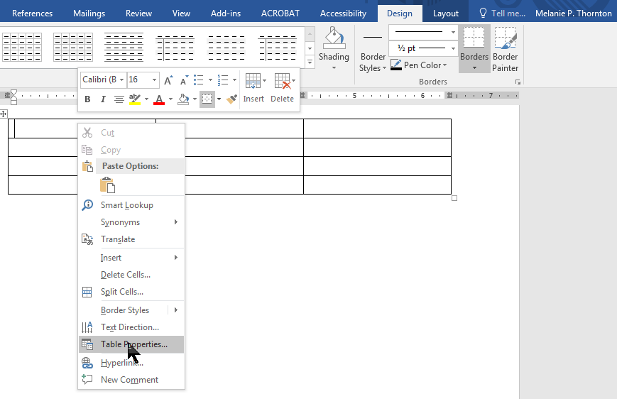
Next, right click on the top row of your table and chose Table Properties.
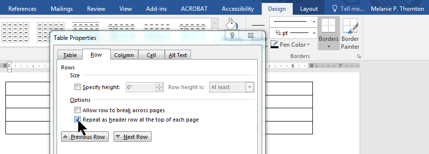
When the Table Properties dialog box appears, select the box labeled “Repeat as header row at the top of each page.”
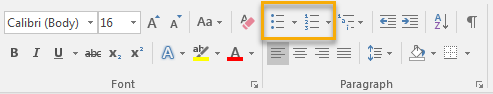
Using Lists
When creating lists, make sure to use the bulleted list or numbered list tools to do so. Creating a proper list provides structure for a screen reader user and makes the content more understandable.
Using the Accessibility Checker
The accessibility checker that is built into Word will identify certain accessibility issues:
- Images with no alt text
- Headings that are not in logical order
- Tables have the header box checked
- Tables that have merged cells or with empty cells
- Large numbers of repeated blank characters
It is important, though, not to rely solely on the Accessibility Checker as it cannot identify all accessibility errors, for example whether or not alt text provides an accurate description or if color contrast is adequate.
Converting to PDF
To convert an MS Word document to an accessible PDF, it is important to first begin with an accessible Word document, following the steps provided in this tutorial. To save as an accessible PDF, you must have MS Word 2011 or 2013 for Windows or MS Word 2016 for Mac. If you are using earlier versions, you will need to have the Pro version of Adobe Acrobat installed in order to save as an accessible PDF. (These instructions assume the availability of one of the more recent versions.)
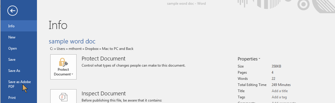
Choose File > Save As Adobe PDF. (Do not Print to PDF as accessibility will not convey.)
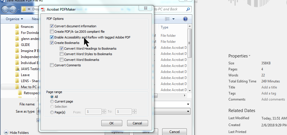
Next, select the options button at the bottom of the dialog box. When the next dialog box appears, make sure the check box labeled “Enable Accessibility and Reflow with tagged Adobe PDF” is checked.
A Few Things to Avoid
Using Full Justification
Left-hand justification is the easiest to read. Avoid using full justification because the spacing, especially when magnified, makes it difficult to track and read the text.
Using Text Boxes
Text boxes are unreadable by some screen readers and may be passed over even by those that can read them. It is possible to use styles to create text with a border around it that is still accessible. Using a single cell table would be the next best option if it is important to separate text in a box.
Placing Important Information in Header, Footer and Watermarks
Some screen readers will not read content in the header and footer areas. Ideally, important information should not be placed in either area. Watermarks are also placed in a different layer from the main text and are not accessible to a screen reader user. They may also disrupt the ability to read the text for a person with low vision.
Adding Space by Using the Return Key
It is ideal to use formatting tools to create space within a document rather than hitting the return key repeatedly. Add the spacing to the headings or paragraphs to achieve the look you want. Use a page break to move to a new page rather than hitting the return key multiple times.
Presenting Data in Rows Without Using a Table
Using tabs to line up data in rows may work visually on a printed document but when a person increases the text size, the alignment is lost and it is difficult, if not impossible for a screen reader user to discern which data is associated with which column.
A Word about Forms
It is possible to create an accessible form in MS Word, but if your ultimate format will be PDF, it is best to add the form elements after converting to PDF. Both formats are rather cumbersome when it comes to creating forms. If you have the option to create your forms in HTML, this is an easier and more accessible option.
You can download this tutorial in PDF format below:
Microsoft Word Accessibility (PDF)
Additional Resources
- MS Word Accessibility Tutorial by MS Office
- National Center on Disability and Access to Education (NCDAE) Cheatsheets
Workshop Resources
If you have attended a workshop offered by Melanie Thornton on this topic, below are some of the resources that are typically mentioned.