Creating Accessible MS PowerPoint Presentations
Introduction
Good design of PowerPoint slides takes into consideration the multiple ways people will be using your slides. The content will need to be accessible to those viewing the presentation live, those viewing printed versions of the slides, and those accessing the content electronically. The techniques provided in this tutorial will assist you in creating accessible PowerPoint presentations regardless of how your users are accessing your slides.
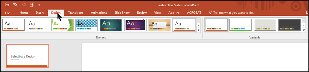
Choosing Design Templates
Select a design for your presentation that provides good color contrast. We will cover contrast more later in this tutorial, but for now, just be aware that not all of the templates available within MS PowerPoint provide adequate contrast.
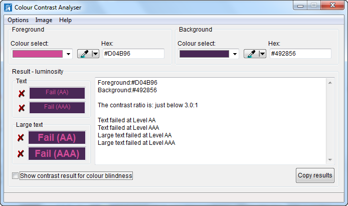
For example, one of the design templates, when analyzed using the Color Contrast Analyzer failed the requirements of WCAG 2.0 at the AA level, which is the requirement adopted by most colleges and universities.
Choosing Slide Layouts
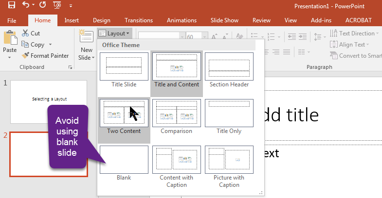
One of the most important things you can do to create more usable slides is to choose a template that suits your content, rather than beginning with a blank slide and adding text boxes to your slide. Why is this important? A simple way to provide the content of a PowerPoint presentation in a more accessible format is to export the text content from the Outline View. When slides are designed by starting with a blank slide and adding text boxes, the content does not appear in the Outline View and will therefore not be exported.
To change the layout of a slide, select that slide and then from the Home ribbon choose Layout and find the layout that best matches your content.
Use a Unique Title for Each Slide
Titles allow a screen reader user to easily navigate a slide presentation. It is important that each slide have a unique title. When similar content continues on more than one slide, you might add “continued” after the title or if you have more than one slide with similar content add numbers to the title.
In the event that you are designing a slide in such a way that you prefer for the title not to be visible, you can give the slide a title and then hide the title. This will allow a screen reader user to access the title but it will not show visually.
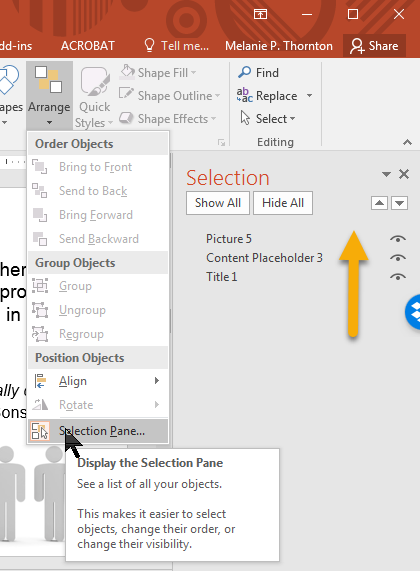
To do this, on the Home ribbon choose Arrange > Selection Pane.
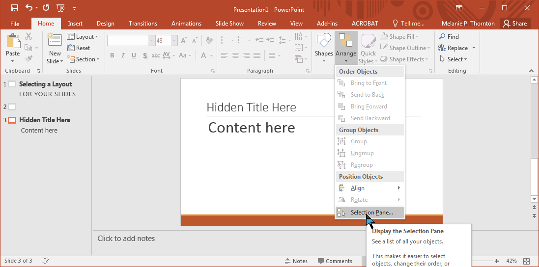
Next, select the toggle hide/show button to the right of the title.
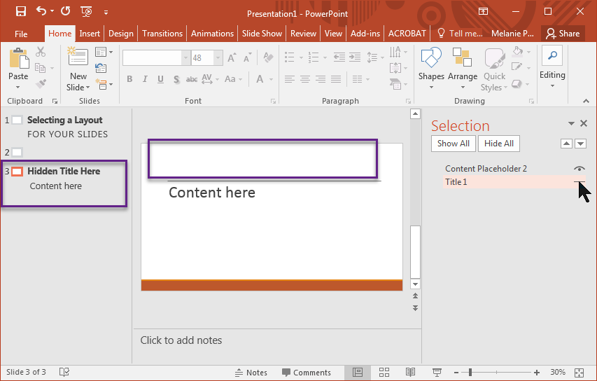
Notice that the title disappears from the slide but is still in the outline view.
Choosing Fonts and Font Size
Font Families
Choose fonts that are clear and easy to read. Sans serif fonts may be easier to read for some people but a simple serif font, such as Times New Roman, is considered fine to use as well. Avoid overly decorative fonts or light fonts.
Font Size
Generally, it is recommended that text on a slide be no smaller than a 28-point font. Ideally, consider shooting for a 44-point title and a 36-point font for content. Creating slides with these larger font sizes increases accessibility for those viewing your slide presentation live and also results in more usable handouts if you choose to create handouts with multiple slides on a page.
Making Images Accessible with Alt Text
Simple Images
A screen reader cannot discern the contents of an image. Alt text provides a way to make the contents of the image accessible to a blind person who is reading your document. To add alt text, right click on the image and choose Format Picture from the context menu.
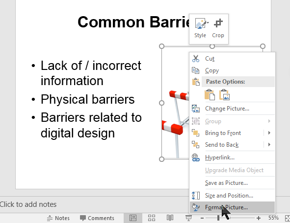
The Format Picture dialog box should appear to the right of your document. Select the Layout and Properties tab and then select Alt Text.
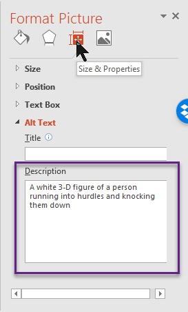
Type a description of the image in the box labeled Description. There is no need to type “image of” or “picture of.” Simply describe what is in the image.
Complex Images
Some images, such as graphs, charts or informative illustrations require fairly lengthy explanations to make them accessible. Provide adequate alt text to describe the image fully.
When adding alt text to charts and graphs created in MS PowerPoint, take care to add the alt text to the full chart or graph. To do this, right click on the outer border of the image, choose format chart area (or format object for other types of art) and add the alt text just as you would for a simple image.
Creating Meaningful Hyperlinks
When adding hyperlinks to a PowerPoint slide, it is especially important to think through the purpose of the hyperlink. If your main purpose is to use the slides for a presentation, is the purpose of the hyperlink for you to open a website during your presentation? Will everyone have access to the PowerPoint electronically? Or will some people have the PowerPoint only in print?
Suppose you are sharing suggested resources with your audience and some people will have print and some electronic versions of your handout. In that case, you will need to include meaningful text for the links but also include the actual URL for those receiving it in print.
Access to Mental Health Toolkit:
Available at: https://exploreaccess.org/access-to-mental-health/
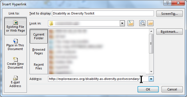
Disability as Diversity Toolkit:
Available at: https://exploreaccess.org/disability-as-diversity-postsecondary/
To add a hyperlink to the text, highlight the text, right click on the text and choose Hyperlink from the context menu.
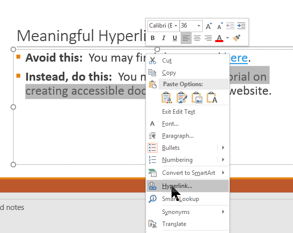
When the dialog box appears, make sure the text that you want to be included in the hyperlink is correct and add the URL below.
Using Color and Ensuring Good Contrast
Color and accessibility intersect in two ways:
- Color alone should not be used to convey meaning.
- Ensuring good contrast between foreground and background elements is important.
Avoid Using Color Alone to Convey Meaning
Color-coded symbols are sometimes used in charts, graphs or other illustrations. Take the maps below, for example. The map on the left might be accompanied by a key that tells what these colored markers represent. Without additional information, someone that cannot distinguish the colors would be unable to decode the meaning. The map on the right provides another alternative. Using both color and a symbol on the markers and in the key makes this version more accessible.

The following map shows what the map on the left above would look like to someone with protanopia, a type of color-blindness. As you can see, with access to only color, it would be difficult to decode the meaning of the symbols since the colors are so similar.

Provide Good Contrast
The World Wide Web Consortium’s Web Content Accessibility Guidelines 2.0 (WCAG 2.0) provides guidance on the minimum level of contrast considered to meet accessibility standards. Based on these guidelines, contrast should be 4.5 to 1 or better. Those numbers mean very little without a way to measure contrast. There are several excellent online tools that you can use to analyze color contrast. First, though you have to determine the RGB color code for the colors you are checking.
Let’s check the default colors on one of the design themes within PowerPoint. Highlight the color of the text you want to check.
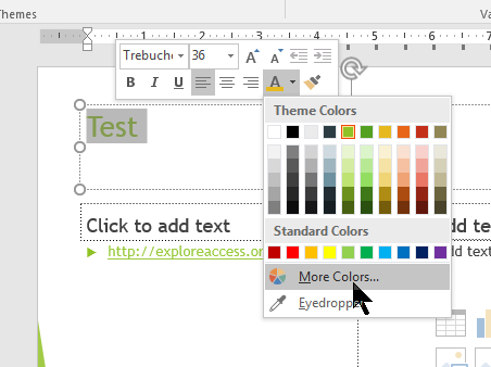
When the font style dialog box appears, select the down arrow to the right of the font color button. Next, select More Colors. Choose the custom tab and you will see the RGB color codes for the text you have highlighted. You will want to record those numbers.
Next, you’ll need to find a color contrast analyzer. There are several options online but not all accept RGB codes. One that does is the Color Contrast Tester by Joe Dolson. It can be found at: https://www.joedolson.com/tools/color-contrast.php
Select the RGB tab and enter the codes.
When you select Compare Colors, the contrast tester will let you know if the contrast is sufficient to meet the standard you want.
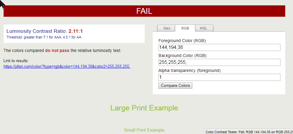
In this case, there is insufficient contrast between the white background and the light green text.
Other Considerations
Data Tables
In order to create an accessible table in MS Word, the table has to be a simple table with the same number of cells on each row and column. That is, it is important to avoid merging cells. To create the table, choose Insert > Table, and select the number of columns and rows.
Next, place the cursor in the top row of your table and on the Design tab make sure that the box labeled Header Row is selected.
Video and Audio
If you are embedding audio or video in your slide presentation, make sure to use captioned video or provide a transcript for audio.
Animations
Use animations sparingly and make sure not to use flashing objects.
Using the Accessibility Checker
The accessibility checker that is built into PowerPoint will identify certain accessibility issues:
- Images with no alt text.
- Missing or redundant titles.
- Tables without the header box checked.
- Tables that have merged cells or with empty cells.
- Reading order needs checking.
It is important, though, not to rely solely on the Accessibility Checker as it cannot identify all accessibility errors. For example, whether or not alt text provides an accurate description or if color contrast is adequate require a manual check.
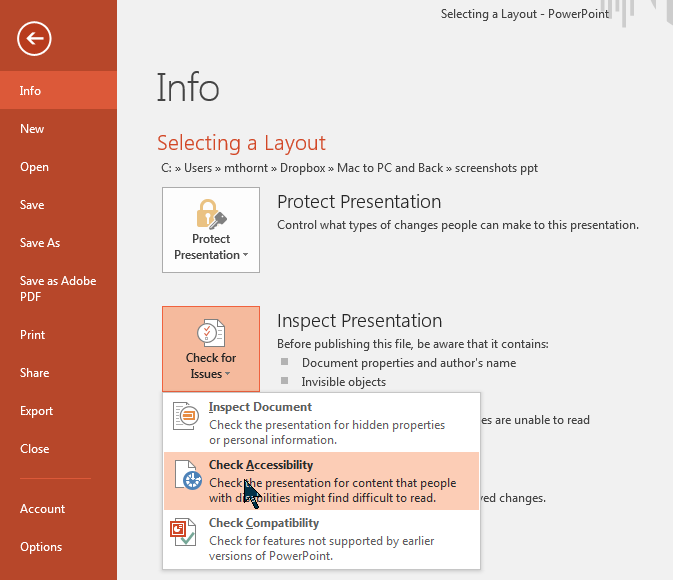
To use the Accessibility Checker, choose File > Check for Issues > Check Accessibility.
Checking Reading Order of Slide Content
You may be instructed by the Accessibility Checker to check the reading order of the slide to ensure that it will read the way it was intended. To check reading order, return to the selection panel. From the Home ribbon, choose Arrange > Selection Panel.
The selection panel will appear to the right of your slide. The order is reversed with the first item being at the bottom and the last at the top. If there are items out of order, drag them to the correct positon.
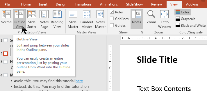
Checking Outline View
Use the outline view as a final check to make sure the text from your slides appear in the outline. From the View ribbon, select Outline View.
Converting to PDF
To convert a PowerPoint presentation to an accessible PDF, it is important to first begin with an accessible PowerPoint presentation, following the steps provided in this tutorial. To save as an accessible PDF, you must have MS PowerPoint 2011 or 2013 for Windows or MS PowerPoint 2016 for Mac. If you are using earlier versions, you will need to have the Pro version of Adobe Acrobat installed in order to save as an accessible PDF. (These instructions assume the availability of one of the more recent versions.)
Choose File > Save As Adobe PDF. (Do not Print to PDF as accessibility will not convey.)
Next, select the Options button at the bottom of the dialog box. When the next dialog box appears, make sure the check box labeled “Enable Accessibility and Reflow with tagged Adobe PDF” is checked.
You can download this tutorial in PDF format below:
Microsoft PowerPoint Accessibility (PDF)
Additional Resources
- Explore Access: Creating Accessible Presentations
- National Center on Disability and Access to Education (NCDAE) Cheatsheets
- Microsoft Office: Making Your PowerPoint Accessible
Workshop Resources
If you have attended a workshop offered by Melanie Thornton on this topic, below are some of the resources that are typically mentioned.